Original Docs

This date range picker component for Bootstrap creates a dropdown menu from which a user can select a range of dates. I created it while building the UI for Improvely, which needed a way to select date ranges for reports.
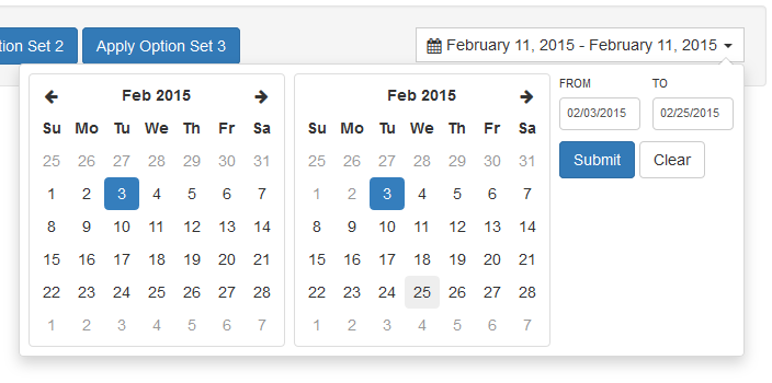
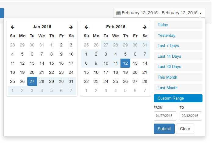
If invoked with no options, it will present two calendars to choose a start and end date from. Optionally, you can provide a list of date ranges the user can select from instead of choosing dates from the calendars. If attached to a text input, the selected dates will be inserted into the text box. Otherwise, you can provide a custom callback function to receive the selection.
The component can also be used as a single date picker by setting the singleDatePicker option to true.
View a demo or Try it in a live application
Usage
This component relies on Bootstrap, Moment.js and jQuery.
Separate stylesheets are included for use with Bootstrap 2 or Bootstrap 3.
Basic usage:
<script type="text/javascript" src="jquery.js"></script>
              <script type="text/javascript" src="moment.js"></script>
              <script type="text/javascript" src="daterangepicker.js"></script>
              <link rel="stylesheet" type="text/css" href="bootstrap.css" />
              <link rel="stylesheet" type="text/css" href="daterangepicker-bs3.css" />

              <script type="text/javascript">
              $(document).ready(function() {
                $('input[name="daterange"]').daterangepicker();
              });
              </script>
The constructor also takes an optional options object and callback function. The function will be called whenever the selected date range has been changed by the user, and is passed the start and end dates (moment date objects) and the predefined range label chosen (if any), as parameters. It will not fire if the picker is closed without any change to the selected dates.
$('input[name="daterange"]').daterangepicker(
                {
                  format: 'YYYY-MM-DD',
                  startDate: '2013-01-01',
                  endDate: '2013-12-31'
                },
                function(start, end, label) {
                  alert('A date range was chosen: ' + start.format('YYYY-MM-DD') + ' to ' + end.format('YYYY-MM-DD'));
                }
              );
Options
startDate: (Date object, moment object or string) The start of the initially selected date range
endDate: (Date object, moment object or string) The end of the initially selected date range
minDate: (Date object, moment object or string) The earliest date a user may select
maxDate: (Date object, moment object or string) The latest date a user may select
dateLimit: (object) The maximum span between the selected start and end dates. Can have any property you can add to a moment object (i.e. days, months)
timeZone: (string or number) The timezone that will be used to display the startDate and endDate in the calendar. This may be a string such as "-08:00" or an offset in minutes from Greenwich Mean Time. Uses Moment.js #zone, see the docs here for more information. If the timeZone option is not set, the calendar will use the time zone set on the startDate that has been passed in through the options, if it has one. Defaults to the local time zone
showDropdowns: (boolean:false) Show year and month select boxes above calendars to jump to a specific month and year
showWeekNumbers: (boolean:false) Show week numbers at the start of each week on the calendars
timePicker: (boolean:false) Allow selection of dates with times, not just dates
timePickerIncrement: (number) Increment of the minutes selection list for times (i.e. 30 to allow only selection of times ending in 0 or 30)
timePicker12Hour: (boolean:true) Use 12-hour instead of 24-hour times, adding an AM/PM select box
timePickerSeconds: (boolean:false) Show seconds in the timePicker
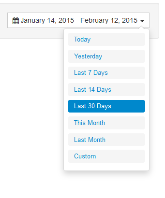
ranges: (object) Set predefined date ranges the user can select from. Each key is the label for the range, and its value an array with two dates representing the bounds of the range
showRangeInputsOnCustomRangeOnly:NEW (boolean:false) Allows the custom range label to trigger the visiblity of the range inputs (apply | cancel | to | from)
opens: (string: 'left'/'right'/'center') Whether the picker appears aligned to the left, to the right, or centered under the HTML element it's attached to
buttonClasses: (array) CSS class names that will be added to all buttons in the picker
applyClass: (string) CSS class string that will be added to the apply button
cancelClass: (string) CSS class string that will be added to the cancel button
format: (string) Date/time format string used by moment when parsing or displaying the selected dates
separator: (string) Separator string to display between the start and end date when populating a text input the picker is attached to
locale: (object) Allows you to provide localized strings for buttons and labels, and the first day of week for the calendars
singleDatePicker: (boolean:false) Show only a single calendar to choose one date, instead of a range picker with two calendars; the start and end dates provided to your callback will be the same single date chosen
parentEl: (string) jQuery selector of the parent element that the date range picker will be added to, if not provided this will be 'body'
Functions
Several functions are provided for updating the picker's option and state after initialization:
setOptions(object, function): This function has the same signature and purpose as the date range picker's constructor: it sets the picker's options to their defaults, overrides them with any values in an options object you provide, and sets the callback for selection changes to whatever function you provide
setStartDate(Date/moment/string): Sets the date range picker's currently selected start date to the provided date
setEndDate(Date/moment/string): Sets the date range picker's currently selected end date to the provided date
Example usage:
//create a new date range picker
              $('#daterange').daterangepicker({ startDate: '2014-03-05', endDate: '2014-03-06', showRangeInputsOnCustomRangeOnly: true });

              //change the selected date range of that picker
              $('#daterange').data('daterangepicker').setStartDate('2014-03-01');
              $('#daterange').data('daterangepicker').setEndDate('2014-03-31');
Events
Several events are triggered on the element you attach the picker to, which you can listen for:
show.daterangepicker: Triggered when the picker is shown
hide.daterangepicker: Triggered when the picker is hidden
showCalendar.daterangepicker: Triggered when the calendar is shown
hideCalendar.daterangepicker: Triggered when the calendar is hidden
apply.daterangepicker: Triggered when the apply button is clicked
cancel.daterangepicker: Triggered when the cancel button is clicked
Some applications need a "clear" instead of a "cancel" functionality, which can be achieved by changing the button label and watching for the cancel event:
$('#daterange').daterangepicker({
                locale: { cancelLabel: 'Clear' }
              });

              $('#daterange').on('cancel.daterangepicker', function(ev, picker) {
                //do something, like clearing an input
                $('#daterange').val('');
              });
While passing in a callback to the constructor is the easiest way to listen for changes in the selected date range, you can also do something every time the apply button is clicked even if the selection hasn't changed:
$('#daterange').daterangepicker();
              $('#daterange').on('apply.daterangepicker', function(ev, picker) {
                console.log(picker.startDate.format('YYYY-MM-DD'));
                console.log(picker.endDate.format('YYYY-MM-DD'));
              });
License
This code is made available under the same license as Bootstrap. Moment.js is included in this repository for convenience. It is available under the MIT license.
The MIT License (MIT)
Copyright (c) 2012-2014 Dan Grossman
Modifications by Greg Benjamin
Permission is hereby granted, free of charge, to any person obtaining a copy of this software and associated documentation files (the "Software"), to deal in the Software without restriction, including without limitation the rights to use, copy, modify, merge, publish, distribute, sublicense, and/or sell copies of the Software, and to permit persons to whom the Software is furnished to do so, subject to the following conditions:
The above copyright notice and this permission notice shall be included in all copies or substantial portions of the Software.
THE SOFTWARE IS PROVIDED "AS IS", WITHOUT WARRANTY OF ANY KIND, EXPRESS OR IMPLIED, INCLUDING BUT NOT LIMITED TO THE WARRANTIES OF MERCHANTABILITY, FITNESS FOR A PARTICULAR PURPOSE AND NONINFRINGEMENT. IN NO EVENT SHALL THE AUTHORS OR COPYRIGHT HOLDERS BE LIABLE FOR ANY CLAIM, DAMAGES OR OTHER LIABILITY, WHETHER IN AN ACTION OF CONTRACT, TORT OR OTHERWISE, ARISING FROM, OUT OF OR IN CONNECTION WITH THE SOFTWARE OR THE USE OR OTHER DEALINGS IN THE SOFTWARE.